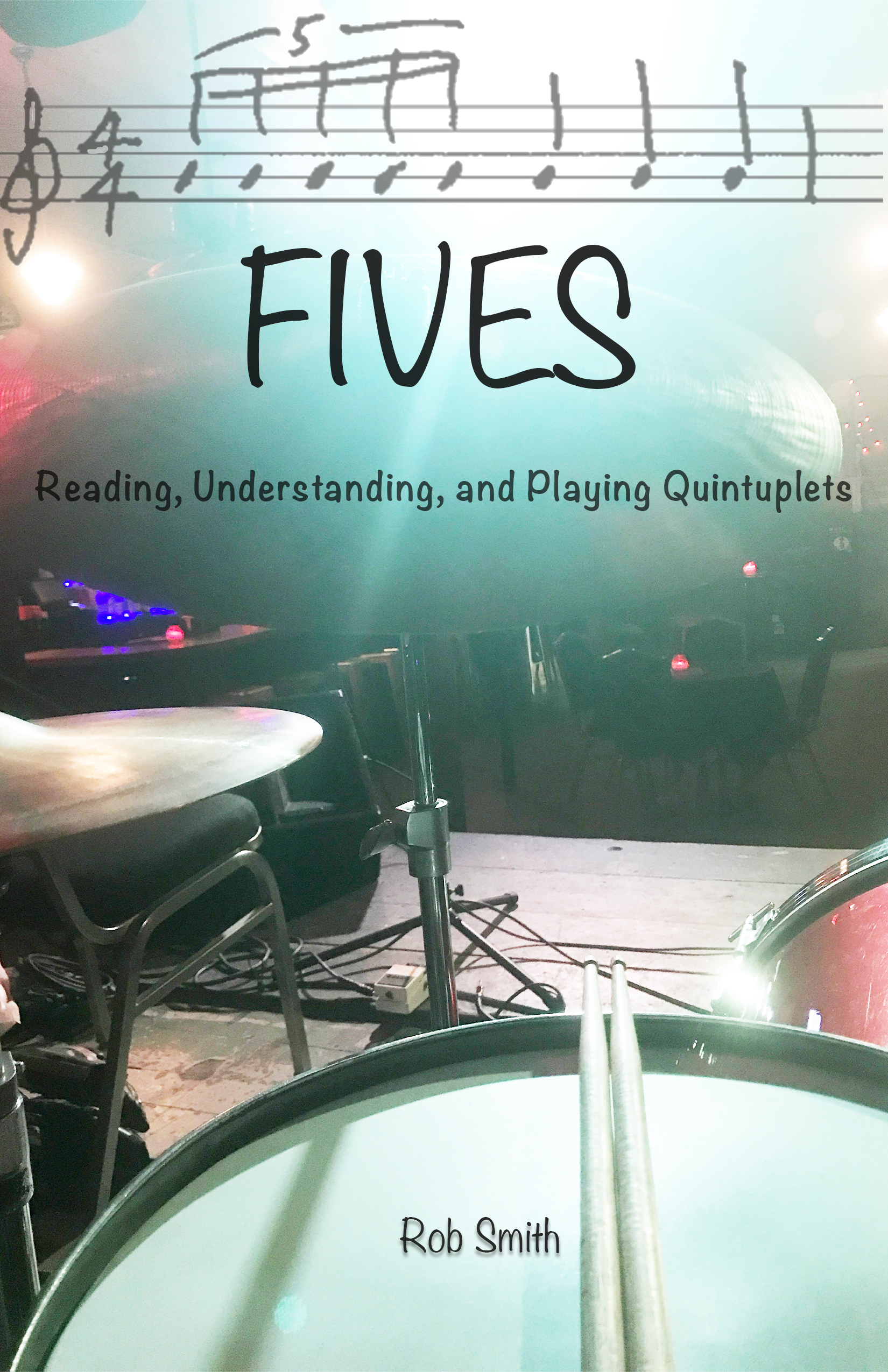
THE BOOK COVER: Using the latest version of Photoshop to do this project I created the background image from a photo I took of my drums on stage. I lowered the opacity to allow for easier blending of other objects and cranked the brightness which gave me space for bolder text. The music staff at the top was also mine. I had to use the magic eraser in Photoshop to eliminate the white background between the lines and notes. I used this image so that it would be clear as to what this book addresses. I then reduced the opacity a small amount so it would settle into the background photo more. This also keeps it from drawing attention away from the title.
The font I used is called “Noteworthy” as I felt this fell best in line with the staff and music notes graphic that lies right above it. I played with drop shadows and whatnot but felt it pulled the lettering too far away from the cover itself, making it seem more fabricated and less organic. I did however use a drop shadow on my name at the bottom to replicate the shadows you see on the drum from the drumsticks.
I did fade the top of the background image a bit to allow the other graphics to pop more and draw the readers eye to the title.
My decision to create this particular cover lies in the fact that I am in the process of writing this book. As you will also discover with my logo, I have decided that the projects I complete for this class will be things I intend to use outside of this class. Therefore, the book cover will actually be used for this book that I have been creating over the past year.

THE LOGO:
As I explained in the book cover project, this logo will become the logo I use for my business, Smithson Arts. This is an interactive, educational website that teaches all the fine arts in an online format. I have been planning on creating this logo for years and, because of this project, have finally accomplished that goal. I guess you could say I put years into this project.
I used Adobe Illustrator 25.3.1 to create this logo.
I started by creating the ellipse. I then used shift+w to get the stroke width tool to create the thickening of the stroke at the top. Then I added a green/black gradient to it, setting it at -90 degrees so that the black would be on the bottom and green on top. Adjusting the gradient sliders helped me achieve the right amount of each color.
I then found a free vector image of a tree with roots. I also used the same gradient on the tree with the same parameters as the ellipse.
I found a free vector quill pen online, changed the color to a deep black, used the eraser tool to take some of the ink trail off and then dragged it to its current position to make it appear that it was attached to the tree roots.
Needless to say there was a lot of sizing and resizing.
Finally it was very important to me that I create this logo with no text for which I will explain next.
The reason behind my choices regarding this logo are somewhat abstract. I began by looking for an idea that would sum up all the fine arts in one image. This was impossible. I struggled with it for days until I thought deeper about what is the flashpoint for art. Then it dawned on me that all arts are creative, and creativity can be illustrated in growth because any time we create, we grow. That led me to the tree. I still felt it needed an indicator of education which is where the quill pen comes into play. This represents the work we must do in order to create. Creativity flows from that work and hence, the pen. The ellipse represents the cycle of creativity and also the breathing we do when we create. All together I wished to convey the feel of creative growth which is what my new online school hopes to accomplish for its students.